Creative Exploration

I was tasked with creating a basic portfolio site design to showcase my work adhering to accessible design and SEO principles without relying on pre-existing templates or CSS. This polished portfolio site aimed at potential employers includes an engaging introductory page, four diverse examples of second-level content, comprehensive wireframe pages with detailed CSS comments, and a clearly organized site map, all reflecting thoughtful design decisions explained in my accompanying paper.

Conceptualization and Planning
In the mind mapping process, I used FigJam to brainstorm and visually organize my ideas for the website's purpose and structure. This helped me clarify the main objectives and layout, ensuring a coherent plan before moving on to detailed design stages.
For competitive research, I analyzed three portfolio-style websites to understand current design trends and best practices. This analysis provided valuable insights into effective layouts, navigation, and user experience strategies to implement in my own design.


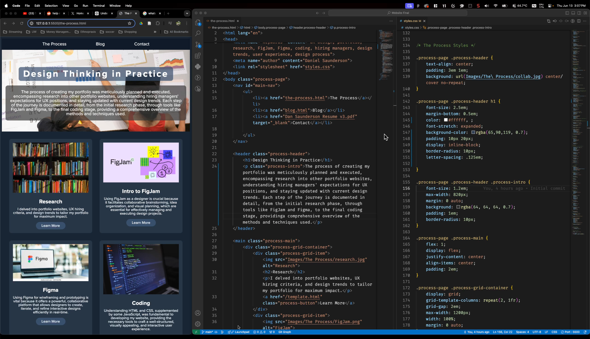
Design Thinking Changes Everything
The prototyping process in Figma was centered around achieving a responsive design that would provide a seamless user experience across different devices. By leveraging Figma's Auto Layout feature, I ensured that elements would automatically adjust and scale to fit various screen sizes. I incorporated elements of the atomic design system, breaking down the interface into fundamental building blocks that could be easily reused and modified. This approach not only streamlined the design process but also ensured consistency and flexibility throughout the prototype. The focus on responsive design was crucial, as it allowed me to create a versatile and user-friendly website that adapts to any device.
The Iterative Process in Coding
The coding process involved translating the high-fidelity prototype into a fully functional website, with a strong emphasis on responsive design. I utilized HTML, CSS, and JavaScript to build the structure, style, and interactivity of the site. Ensuring that the site looked and functioned well on various devices was a primary focus, so I implemented media queries and flexible grid layouts. I incorporated best practices such as clean, semantic code and organized file structures to enhance maintainability and scalability. Throughout the process, I tested the site on different browsers and devices, making necessary adjustments to achieve a consistent and polished user experience.